Internship, Tokyo, June to August 2026
Sollo
I redesigned and built Sollo’s app for foreign residents of Japan. It shipped to the App Store in nine languages, and its main screen got eight times faster.
Sollo helps foreign residents of Japan with visas, healthcare, housing and benefits. The people using it are often stressed, and most don’t read official Japanese. If the app is slow, hard to read or only in English, it lets down the exact people it’s for.
Before and after
Before
Browsing guides, the thing people do most, took 1,033ms. One colour from a design handoff measured 2.72:1 against its background, too faint to pass WCAG AA, the accessibility standard for readable text. The button out of a failed search was 36 points, and three of the five tabs still said “coming soon”.
After
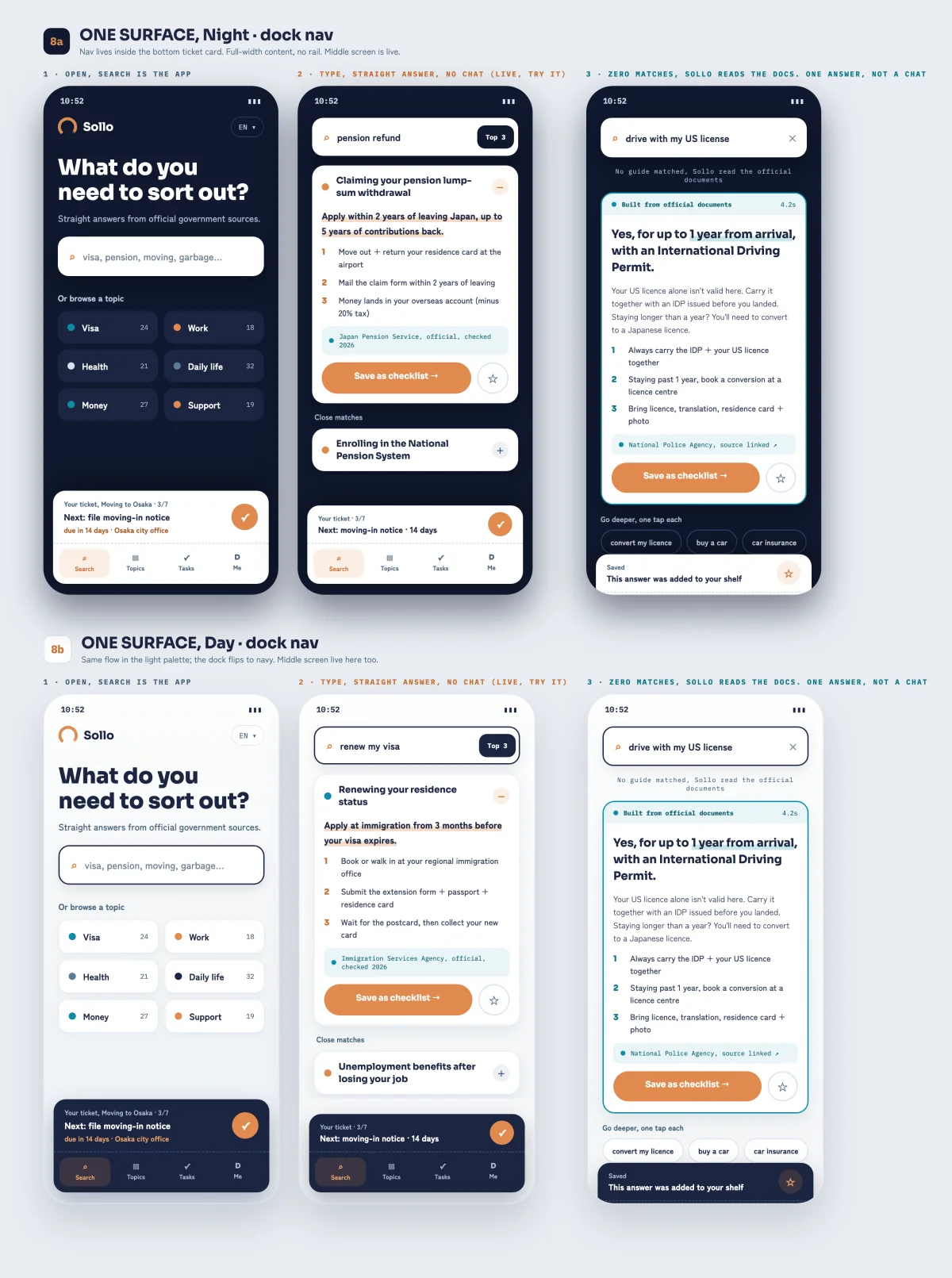
Browsing takes 125ms. That colour passes at 4.60:1, and 7.75:1 in dark mode. The button out of a failed search is 48 points, and the app opens on one working screen. Every new string ships in nine languages, Easy Japanese included. Sollo Life Nav has been on the App Store since 18 August 2026.
How I worked
Research
I was living the problem
For eight weeks I was a foreigner in Tokyo too, so I used the app the way its users would. Then I measured it: how long the main screen took, how readable each colour was and how big each button was.
Define
Four rules before any drawing
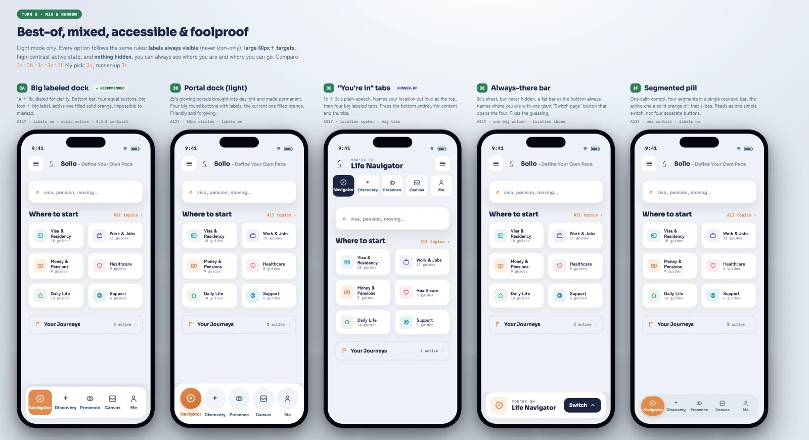
I set four rules for the navigation first: labels always visible, targets of 60px or more, a high-contrast active state and nothing hidden. Someone reading in their second or third language shouldn’t have to guess what a button does.
Design
Eleven options, three rounds
I drew the navigation eleven ways over three rounds on a design canvas, a board of phones side by side. I showed the team every option at once, so the differences were easy to see and we could pick fast.
Turn 3: five options, each held to the same four rules. Build
Design and code, same person
I rebuilt the signed-in app around the option we picked and connected it to the live services, in the mobile app and the Python backend. I also built the design system: colour, spacing and type tokens (named values every screen shares) and a light and dark theme.
Test
Measured, then fixed
Over thirty pull requests focused on speed, I took browsing from 1,033ms to 125ms and cut 3.1 MB from what each phone downloads. An automated check holds every colour to WCAG AA, and 2,949 automated tests were passing when I handed it off.
The turning point
The fork in the road
Sixteen days after I built the five-tab navigation, I cut it down to one screen for the public beta.
Why I went this way
Three of the five tabs still said “coming soon”. A tab that opens onto nothing tells people the app is unfinished. The easier path was to keep the tabs and wait. I parked the tab bar instead of deleting it, so it’s ready when those parts ship.
The proof
- 8×faster to browse guides, 1,033ms down to 125ms
- 9languages for every new string, Easy Japanese included
- 4.60:1contrast on a colour that failed at 2.72:1
- 48ptway out of a failed search, up from 36pt
What it meansSollo is for people who don’t read official Japanese. Fast, readable and fully translated is how it keeps that promise. It shipped to the App Store on 18 August 2026 with 70+ of my pull requests in it.